Cheers to our friends and the other honorees for being featured on the DIELINE, which recognizes and celebrates brands from around the world that are committed to excellence in packaging design.
September 29, 2020 — Comments are off for this post.
“Inclusivity in Beauty – Braille And Colour Makes Sub&Tarctic Accessible To All”
May 8, 2020 — Comments are off for this post.
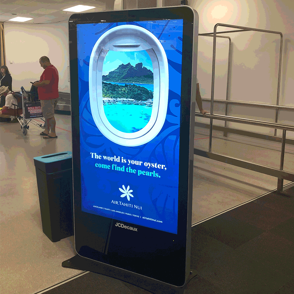
Air Tahiti Nui Airport Takeover
We created an digital campaign for Air Tahiti Nui that made Auckland Airport a little prettier to look at.
May 5, 2020 — Comments are off for this post.
Plant Based Milk
Great to see The Alternative Dairy Co - Barista Milk in Countdown. The colours pop on shelf for sure!
May 4, 2020 — Comments are off for this post.
Sub and Tarctic
Here’s a peek at newly crafted brand work for Sub&Tarctic- the world's most southern-based skincare company.
April 14, 2020 — Comments are off for this post.
Time of Change
We’re twenty days into lockdown. The world has changed and how we do business is markedly different right now. We are going through challenging times, and it won’t just be this lockdown period, but how we all come out of this - that will be telling.
Adversity can bring communities and people together, and bring out the best in each of us. As I walk past people in my local community (yes more than 2 metres apart), we greet with a hello, and an enquiry to ask how we are. There is a feeling of genuine care.
Our Redfire team has been resourceful as we work remote. Thank goodness for technology. Work continues as we adapt, and productivity seems to have lifted. These bubbles have heightened creativity, and when this crisis ends, maybe remote work practices will become part of the new norm.
Localism is flourishing as communities support each other. A Care Culture has developed as a new brand and community metric, where performance conflates with purpose and generosity. And we are all plugging into self-care, up-skilling and passion projects online.
So rather than sit back and wait, our team has been busy designing and creating new ways for our clients to engage and connect with their customers and audiences virtually. We have been continuously surprising ourselves with new and exciting ways to deliver brand engagement that provides a Care Culture.
We are optimistic that the world will get better, and this experience will make us all better human beings and better businesses. Redfire was founded with a vision to do more with less, and challenge disruption with rigour and imagination.
If your business needs help to forge ahead in this unprecedented time of change, we’d be happy to help. Stay safe. Stay well.
Regards Colin.
March 10, 2020 — Comments are off for this post.
20 years of creativity
Celebrating 20 years of creativity
2020 marks 20 years of creativity for Redfire. It's been an amazing journey, and we are so thankful to work with so many wonderful brands, clients and collaborators along the way. Happy Days 🙂
September 27, 2019 — Comments are off for this post.
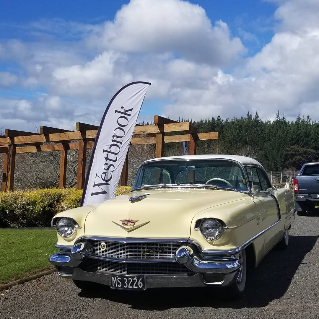
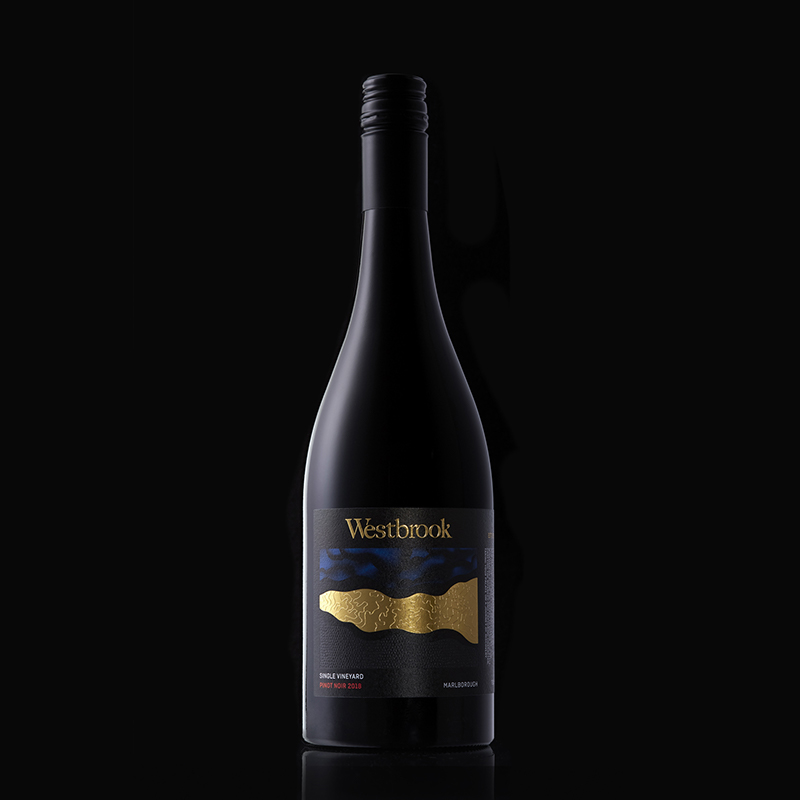
Rebrand and packaging refresh for Westbrook Winery
September 27, 2019 — Comments are off for this post.
Beverage packaging design – Osom spiced water
Flavourful and healthy hydration from naturally - occurring ingredients. Osom spiced water contains bioactive compounds that may have powerful medicinal benefits.
The brand and packaging design we did for Osom has the potential to be the big player in the emerging functional health beverage market.
August 12, 2019 — Comments are off for this post.
Poster design for Grammar Juniors Rugby Football Club
Grammar Juniors Rugby Football Club briefed us to create the marketing communications for their 2019 annual club dinner. Tasked with the challenge of creating an invite to a Japanese themed dinner - in honour of the 2019 Rugby World Cup. Our approach was to use comic book style typography and images inspired by the manga graphic novels to create an unique aesthetic to engage diners to get their team together and have fun dressing up in their Japanese inspired costumes.
July 16, 2019 — Comments are off for this post.
The bottle of wine you would be proud to take to a dinner party
Sky, Topography, Terroir dominate packaging design with solid bold visuals, using textural finishing with both de-bossing and embossing over foil and seals supporting our inspiration from Westbrook's unique terroir and textural characteristics produced in every wine.
We don’t want to be good; We want to be better. Better impacts for our clients, team, community and planet.
Creativity for BetterCreativity for BetterCreativity for Better